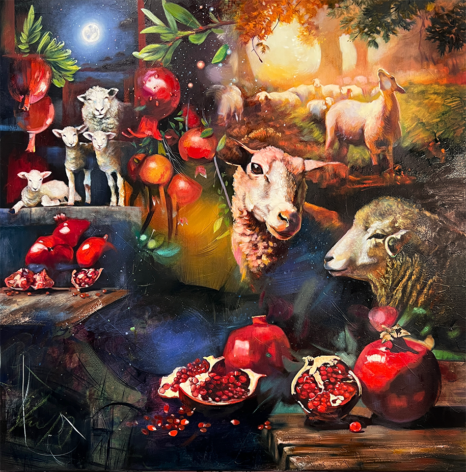
Pulling the Far Things Near: A Grand Prophecy and Beauty the World Has Never Seen

I am at a spiritual retreat where we have just received an invitation to ask God for something big, something so beyond us it may even scare us. Right away, I recall a prophecy given to me the year before: "You will discover new colors the world has never seen—colors that come from heaven. You will create paint with these new colors, and it will revolutionize the world of painting."
Although this feels super lofty and surreal, I am excited by the possibility. It feels like this is the moment I can ask God to show me these colors. I think if I can just see them, even for a moment, I can conceptualize what colors that don't yet exist might look like.
I wait and keep asking God to show them to me. Then suddenly, a strange taste occurs in my mouth. It's a taste and a feeling. My mouth feels dry and astringent. The taste I experience is like pumice—mild but earthy, mineral, and slightly briny. The taste isn't bad, but it's not exactly good either; and I certainly do not see any colors.
I keep asking God to show me the colors in heaven that don't exist here on earth. Nothing comes except a stronger sensation of that weird taste in my mouth. I think about Ezekiel eating the scroll and it tasting bitter. I am extremely disappointed. I am so hoping to see color like I have never known, but on the other hand, I am in awe that I experience such a unique and powerful sensation from God.
This whole experience perplexes me as I sit with it and wrestle with so many questions. My first question is, “Why, when I ask to see a color, does God respond with a taste?”
As I ask this question, I hear in my spirit that to perceive color, we must have context. We understand the color blue within the context of what blueberries taste like, or the way water feels. Blue is deep, refreshing, and wondrous. We can understand what red looks like within the context of how fire feels and the bright crisp taste of a strawberry. To see more color, we have to build our library of context. At this realization, I can only wonder what the taste of pumice looks like as a color.
I start to think about how we can only see a tiny spectrum of light and color and are blind to the other representations of light. We don't see gamma rays, microwaves, X-rays, and many others. They exist; they are there, but we don't see them.
Illuminating the Invisible

Then God tells me something incredibly shocking that I still can't fully understand. I hear Him say, “Everything you know—even what you can’t see—is from the spectrum of light that I created. But in heaven, there is something so far beyond the furthest reaches of that spectrum that it is on a whole other level. What you know of is created light, but in heaven there is Creative Light.”
I feel like God suggests that this Creative Light is what is behind miracles like healing, manifestation, or transcendence. Without an edifice to behold such wonders, we don't see it or experience it. This was the meaning of the strange taste in my mouth.
Not long after, I am reading Kandinsky and his theories about color and sound frequency, and I am struck by his claim that warm colors move exocentrically and cool colors move endocentrically on an atomic level, which makes cool colors appear as if they are receding and warm colors as if they are coming forward. I begin to think about the color Alizarin crimson and realize I always use this color for backgrounds or things that are far away from view, and I use cadmium red medium when I want something to pop forward. It is the same with ultramarine blue and Prussian blue. My eye can see it, but I’ve never known why.
I am just starting to teach at this point, and I find myself deeply involved in teaching beginners how to oil paint. My major struggle is watching them repeatedly create mud and mix ugly colors that all look anemic. I come around and say, “Don't mix everything together! You have to make beautiful colors.”
The students look at me, frustrated, and say, “Yes, sure, I would like that, but how?” I think I am the world’s worst art teacher. I can't figure out how to teach color mixing. I know how to do it, but I don't know how or why I know it. I have no process for it. I have seen the percentage method, but I reject it because I don't want everyone premixing color with their left brain; they need to learn how to see it in the moment, respond intuitively, and become fluent in color mixing.
Divine Discovery

I look up all the commonly used colors and notice that exactly half are warm and the other half are cool. I discover that each color family contains both warm and cool colors! It is as if God always knew when creating the elements, minerals, plants, and animals that these pigments would paint his divine beauty, making colors move and frequencies dance to bring paintings to life. Color alone has a voice! I research further and find out that acrylic paint isn't the same. The plastic binders hold the colors hostage, and they don't move. If a cool pigment is next to a warm pigment, it looks like they are on the same plane.
I am so excited about all these discoveries God leads me to and what they mean for artists! I introduce these ideas to the students I have at the time and tell them to divide their palette into warm and cool. They put all their warm paints on one side and draw a plus sign to remind them that warms pull forward, and on the other side, they put their cool paints and a minus sign to remember that cools recede. I instruct them to only mix warms with warms and cools with cools. No matter what concoction they create with color, the colors still move and do not neutralize or become static.
I watch as even artists who are brand new to oil painting mix beautiful colors effortlessly. Even if they make a brown or gray, it is a beautiful brown or gray. Everyone starts to have more fun painting and stresses a lot less about color mixing. Everything seems perfect, and my discovery leads to a whole teaching method that is foolproof.
Except, there is a small hiccup.
The color spectrum in warm and cool has a couple of holes. It seems nearly impossible to mix a warm magenta or warm turquoise, or a cool periwinkle blue or cool sunset orange. At times, I want an ultramarine blue or fire engine red like cad red medium to be in the background and recede. When painting peacock feathers that I want to pop forward, I am missing an electric turquoise for that. For years, I resign myself to just missing some colors.
A few years later, I am making my own paint line with a paint manufacturer. As I talk to him on the phone, I realize that paint companies make the same colors all the time and don't try new pigment mixtures. The formula for Phthalo blue and Prussian is always the same.
However, in the world of pigments, there is so much room for more expressions of color while still staying cohesive to warms with warms and cools with cools. It takes me more than two years, but with the help of our paint manufacturer, we create formulas that break through the traditions every artist has been bound to for centuries.
Color Beyond Boundaries

We create ten colors of vivid, bright, intense paints that defy warm and cool stereotypes. We make a warm turquoise and magenta and a cool fiery red, orange, and periwinkle blue. We manage to fill in the gaps of the color spectrum and truly create colors that the world of paint has not seen.
The first time I personally used this paint was when I created my octopus painting, “Garden of Dreams.” The paint allowed me to create a fiery glow that recedes and a bright turquoise that pops forward. My mind does flips and my heart jumps when I see what these colors can do. There is something remarkably different about this octopus painting compared to my other paintings.
Just last week, I finished filming a new oil painting course all about color temperature and how to use these new Vivid paints. As I think about this 10-year journey with color and all that God has shown me and given me hope for, I can imagine the possibilities. We are only getting started with color innovation.
Vivid Visions
I don't think these Vivid paints are exactly the fulfillment of the prophecy I was told years ago. I still believe there are colors that don't even fit into our known color spectrum. They couldn't be described as a red, blue, or violet. They are not blueberries, water, or fire. They are pumice. Something outlandishly different.
Maybe these colors are not a part of the created light spectrum but belong to the creative light spectrum. Maybe just one glance at these colors will initiate deep healing, or like magic, make manifest a new opportunity. Maybe these colors will even bring heaven to earth so that we will all live in a world of creative light.
I really don't know, but can only dream and imagine. But creating these ten vivid colors—colors that seem a little bit magical and open new color mixing possibilities—is a start. They serve as an edifice for what is going to come. They are the beginning stage of a promise. For me, they are a constant reminder that with God, ALL THINGS ARE POSSIBLE!

How do you imagine colors from heaven?


Elli, about a year ago I was worshipping in church and had a vision that lasted just a few seconds. I briefly saw heaven in a vibrant array of amazing colors. What appeared as so many shades of peachy pinks and undescribable luscious and illuminated citrusy colors. I saw such beauty and knew they were an invitation to desire more prophetic inspiration. I started a painting during the next day at that conference during worship service where I typically paint as a form of worship. A lady came up to me and said what she was seeing as I painted was new heavenly color inspiration and she had to have that painting when I was done because it spoke to her inspiration for a new ministry adventure she was starting.
What you are referring to as new inspired colors is actually something I believe is God’s desire for us…to experience Heaven on earth and to paint from that reality. I wish I could paint what I actually saw, but I sure felt the inspiration of it as I painted.
One other time I felt God inspired me to paint the sound of heaven through color. That too was a supernatural experience that I could only feel as I painted from that inspiration. Walking with God and painting for his glory has been my life and going through the Mastery program (although slowly this far due to life commitments) has been so inspiring and has helped me greatly! Thanks for all you do.
———
Elli Milan Art replied:
Painting the sound of heaven sounds glorious!!
It was with great emotion that I read your testimony about experiencing colour creation ! I’m not surprising it comes to you. It is palpable and visible in your vivid and lively paintings. I believe we paint with all our senses and you could not express it so precisely and poetically. I’ve avidly read your words as I’m sure this is a call for forthcoming changes you will bring to the world of painting.
I’m so delighted I came across your free videos to know about your artwork and get to know you !💖Magic is yet to come because you’re right there are many “lighty colours” as I call them, waiting to be tasted, seen, heard, touched and felt ! Let’s go and get them ! 😍🙏🏻
———
Elli Milan Art replied:
Thank you Samira! What a beautiful and encouraging message. It makes my heart sing that you enjoy my art the way you do. 💕
Thank you for sharing your journey with this. I love God is giving you new colors! He told me something similar years ago and I figured it was just for after we get to heaven. But that’s is crazy exciting we could see it this side. Thanks again for all you do and the way you are pioneering new things in the art industry. You are a true inspiration. I am so grateful I get the opportunity to be in your Mastery program.
———
Elli Milan Art replied:
That’s so cool you heard something similar!! 🙌🏽
I love your stories, Elli! You are so inspiring 😊
———
Elli Milan Art replied:
Thank you! 💕
Thank you for sharing your journey about colors. Are your paints available for purchase?
I’ve been a painter for many years. Having had an adult and child nde (near death experience) I’ve given up on bringing pure colors that I experienced to a physical medium. I’d love to experiment with your paints.
❤️
———
Elli Milan Art replied:
Hi. Yes. In just a few weeks they will be for sale! First week of December! I’m so excited!
Leave a comment